My Work
Work samples from my employment and education
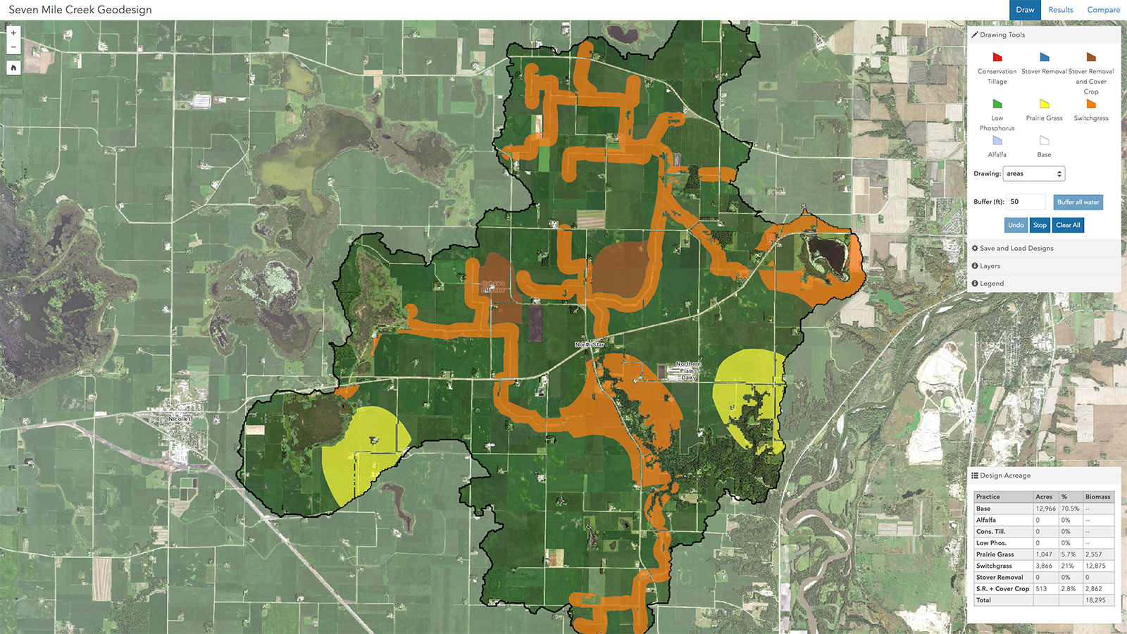
Collaborative Geodesign
Working at U-Spatial, I became a part of the New Agricultural Bioeconomy Project and took over the development of the project's collaborative geodesign application for the Seven Mile Creek watershed. The geodesign application incorporates SWAT model results for various agricultural practices (e.g., corn/soy rotation, conservation tillage, prairie grass), along with reference and data layers, and allows users to experiment with landscape design and change in an iterative fashion.
When I took over development of the application, there were notable stability and performance issues that negatively impacted the reputation of the application and slowed exploration of designs during collaborative sessions. I fully rewrote the application, switching from an all-vector approach with heavy reliance on server-side processing to a client-side focus on the vector components, with optimized server-side processing of final results using raster data. Design processing times were reduced from greater than 60 seconds (often in the 90-120s range) to roughly 15 seconds. User interface, functionality, and performance improvements on the client resulted in observed increases of productivity and engagement by stakeholders using the tools.
With stability and performance problems in the past, I was able to add additional functionality and agricultural practice options to the tool, and make other changes informed by user observation.
The Seven Mile Creek geodesign application remains available. I developed a similar application for multiple subwatersheds of the Middle Cedar watershed in Iowa. Note: These applications were developed specifically for the 1920x1080 displays on a set of 55" touchscreen displays used by the project. While the designs are somewhat responsive, the focus was proper operation on large touchscreens with medium resolution.
Related: See the Talks & Conferences section of the Development page for info on the two conference talks I've given on geodesign.
Tools used: ArcGIS Desktop, ArcGIS Server, PostgreSQL+PostGIS, Python, ArcGIS API for JavaScript
Landscape design (edits)
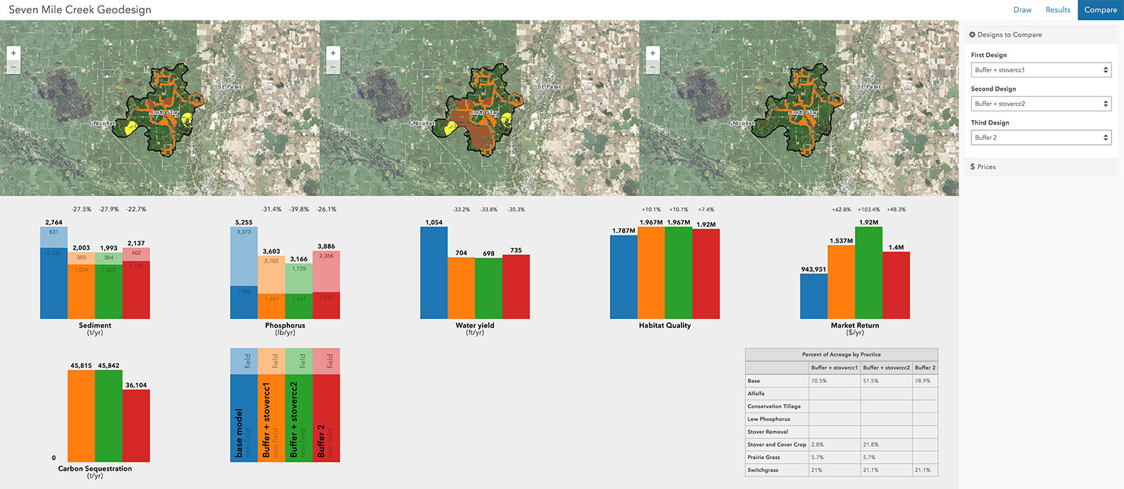
Results visualization
University of Minnesota Homesite
In 2014-2015 I participated in my third University of Minnesota homesite redesign, this time as the lead developer. Many months of work by the project team served to identify required content and structure, and begin content development. A designer and I were tasked with designing and implementing the site. This was the first responsive site either of us had been primarily responsible for, and with up to 100,000 unique visitors a day it was critical that the site function well. Through many cups of coffee and hours together, we designed and implemented a much-improved version of the University of Minnesota homesite.
Web address: twin-cities.umn.edu

Land Cover Change: Detroit Area
A two-person, self-selected, final project in my introductory remote sensing course, my partner and I developed a story map to allow users to explore urban decline and renewal in Detroit. Much of the excitement on this project was the result of the challenges encountered and the need to meet them. You'll have to check out the story map for details. Short version: We created land cover classifications for Detroit in 2005 and 2014 using NAIP imagery (bad imagery, for 2005), produced a classification change raster, and, dissatisfied with that product, used a focal function on the change raster to produce an alternative product.
Tools used: ERDAS Imagine, ArcGIS Desktop, ArcGIS Online

Land cover change, focal function
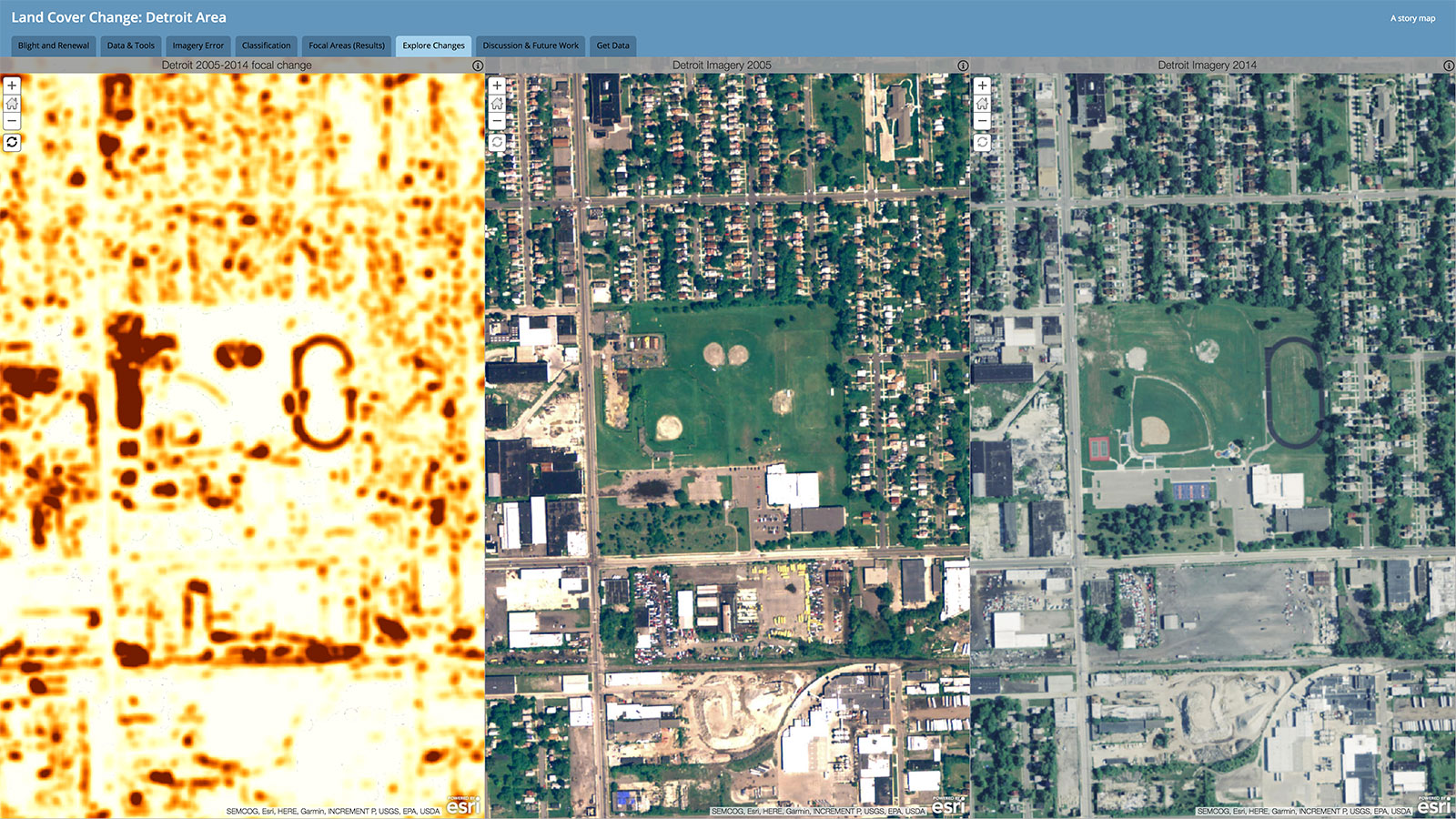
Comparing imagery using the focal change product as a guide
Road Map of Northeastern Minnesota
I produced a basic road map of northeastern Minnesota using ArcGIS Desktop and Adobe Illustrator, along with some custom symbols developed using the MUTCD and MnDOT"s sign standards. This was done as a lab assignment in my second-semester ArcGIS course. Required features were only interstate, U.S., and state highways; counties; and populated placed. Beyond that, included features were at my discretion, and all cartographic decisions were mine, it just had to work in a 17" x 13" area and be useful as a road map.
Tools used: ArcGIS Desktop, Adobe Illustrator
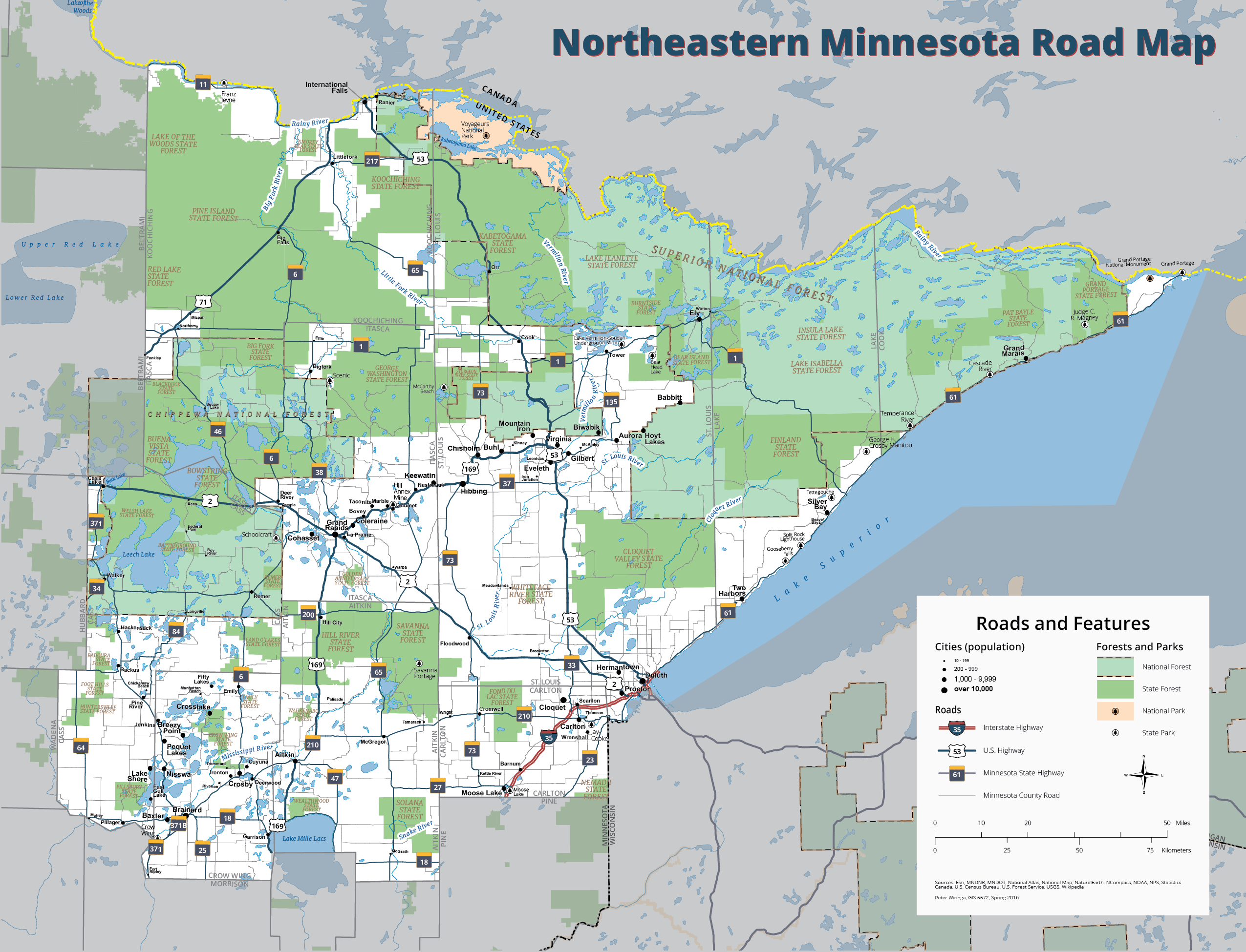
Road map of northeastern Minnesota
New York City Taxi Animation
As a project for the Advanced Geovisualization course, I explored the display of New York City taxi trips in animated form. Focusing on three week period and constructing hexagonal bins 1/20th of a square kilometer in area, I spatially joined origins and destinations for intra-Manhattan trips to bins. The animation was constructed using a Python script and a map layout ArcGIS Desktop, updating the field used for symbology, along with the text in the layout, for each time windows and saving a PNG image. An animation was then constructed using FFmpeg. Several iterations of the animation were produced based on feedback from viewers.
Tools used: ArcGIS Desktop, PostgreSQL, Python, FFmpeg
Nitrate Removal in Part of the Le Sueur Basin
Created to support high school environmental studies curriculum under development, this application allows users to test the effects of landscape change on nitrate concentrations and loads as water moves through a sub-basin of the Le Sueur basin. Designs are processed through a model that was provided as a MatLab-generated executable.
Tools used: ArcGIS Desktop, ArcGIS Server, PostgreSQL, ArcGIS API for JavaScript, Python

Landscape design (edits)
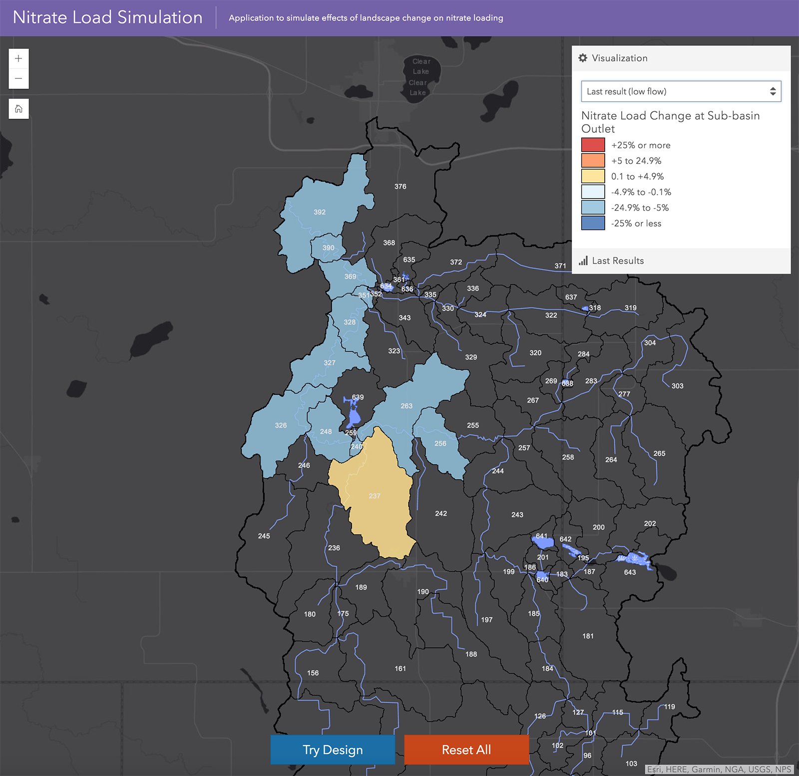
Results visualization
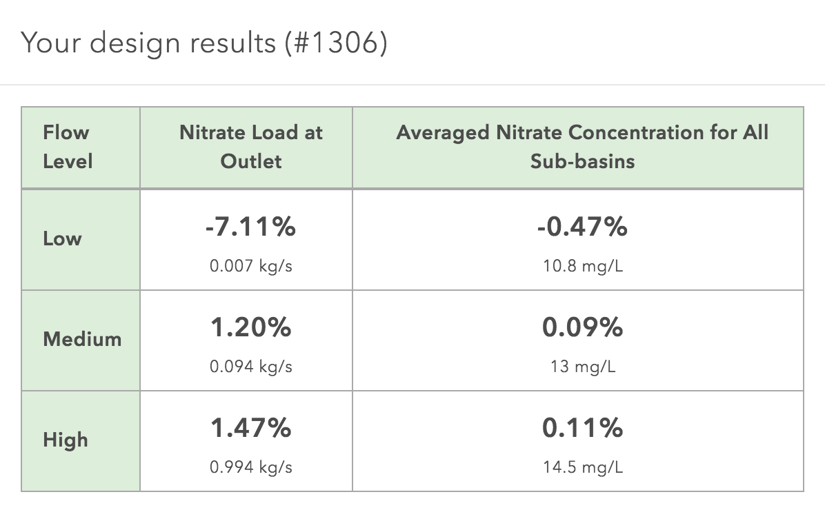
Results table
West Bank Sign Inventory
For our Professional Development and Project Management course, we were placed into teams and assigned areas of the University of Minnesota Twin Cities' West Bank area in order to collect sign information. This task was primarily an exercise in project management, with our team responding to a fictitious RFP, providing status updates throughout the course of the "contract," and providing final deliverables, including data, presentation, and report.
My major role was the technical implementation and data management for the project. I established a file geodatabase in Esri ArcGIS Desktop to store our sign data, leveraging subtypes, domains, and attachments. Once the structure was in place, the geodatabase was uploaded to ArcGIS Online and the Collector for ArcGIS app was used by the entire team to collect sign locations and additional information. Data was extracted from ArcGIS Online following quality control work and provided to the vendor as a file geodatabase with attachments.
Tools used: ArcGIS Desktop, ArcGIS Online, Collector for ArcGIS, ImageMagick, Python
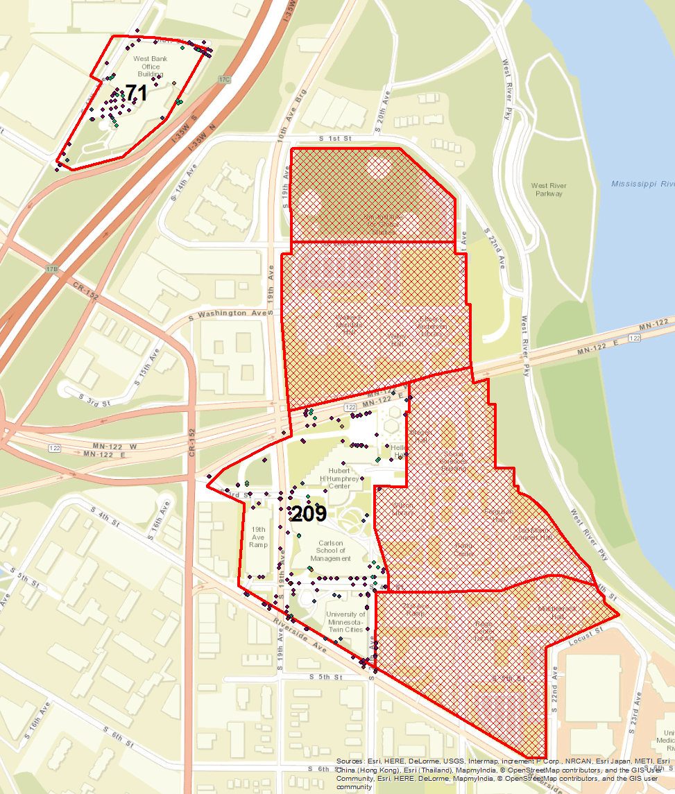
Map of assigned areas with total signs collected per area from ArcGIS Desktop
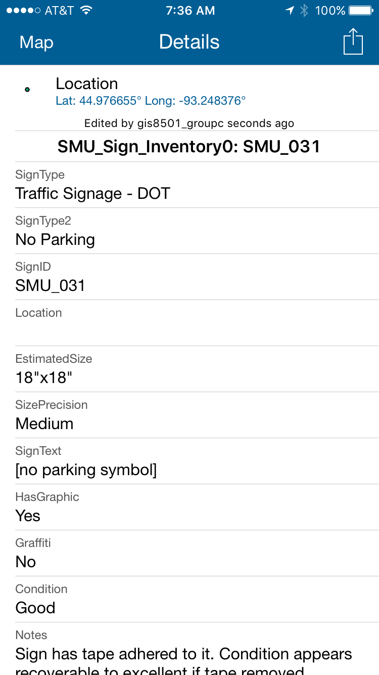
Partial information for a single sign entered using Collector for ArcGIS
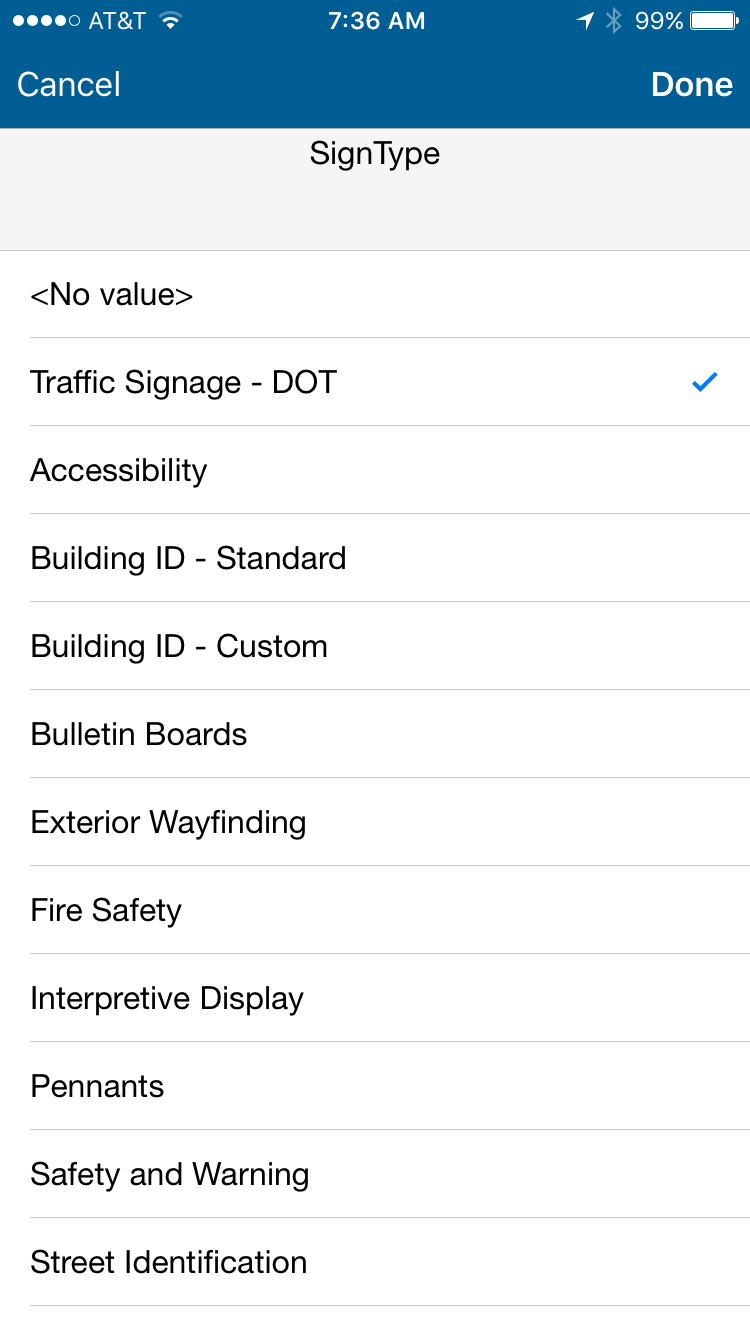
Using subtypes and domains to standardize data entry in Collector for ArcGIS
Digitizing using ArcGIS Desktop
As a part of my first ArcGIS course in my graduate program, one of our tasks was to digitize Holman Field in downtown St. Paul, Minnesota using a scanned FAA airport diagram from 2007. After georeferencing the airport diagram, I was able to digitize with high accuracy the airport runways based on their magnetic headings, known length and width, and noted magnetic variance and yearly change provided on the diagram.
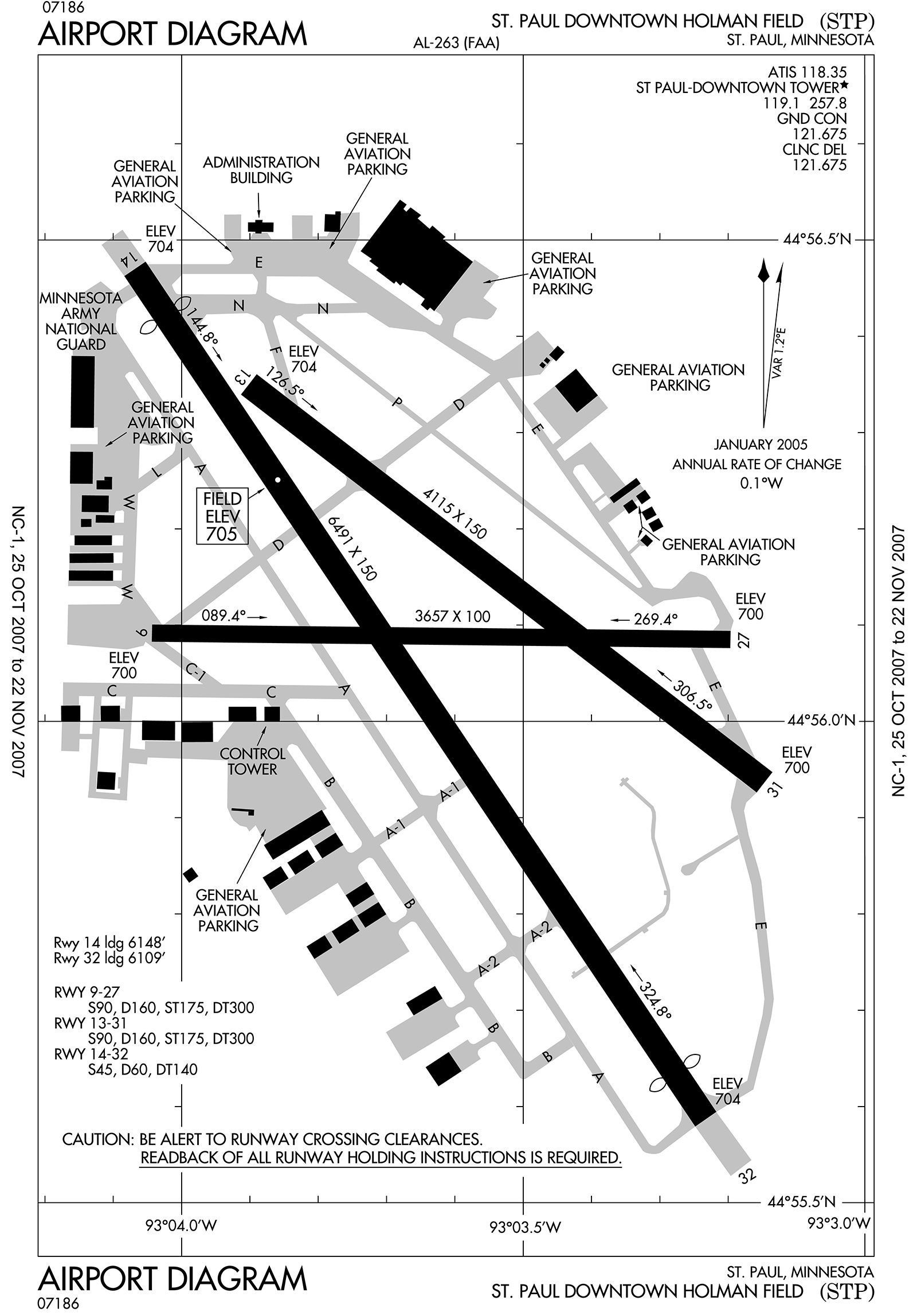
Source material for digitization
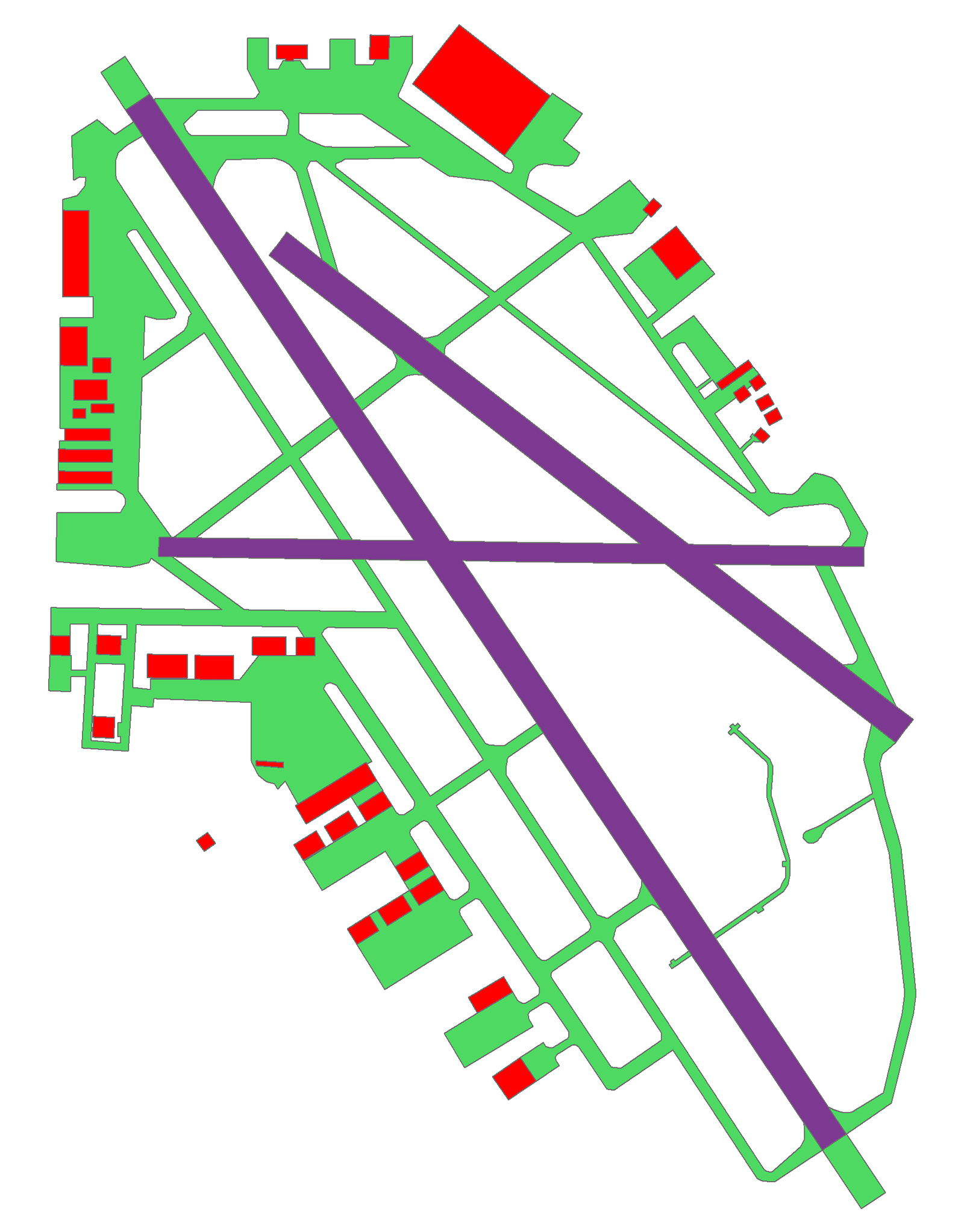
Feature output from digitization
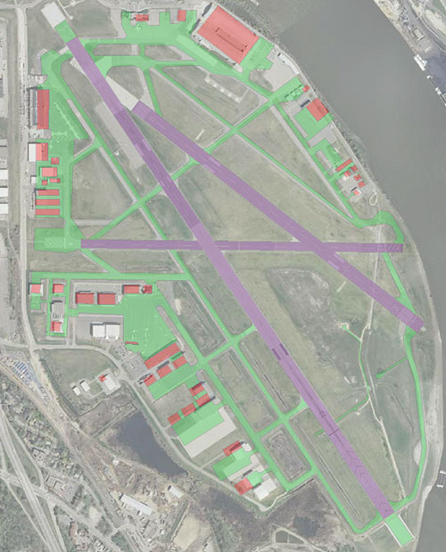
Overlay of digitized features with more recent aerial imagery. Note the accuracy of the runway alignment and runs.
Vectorization using ArcScan in ArcGIS Desktop
I have experience using ArcScan for vectorization of source materials. Using two scans—black & white and color—of contour maps covering an area near Gunston Hall in Virginia, I vectorized the contours.
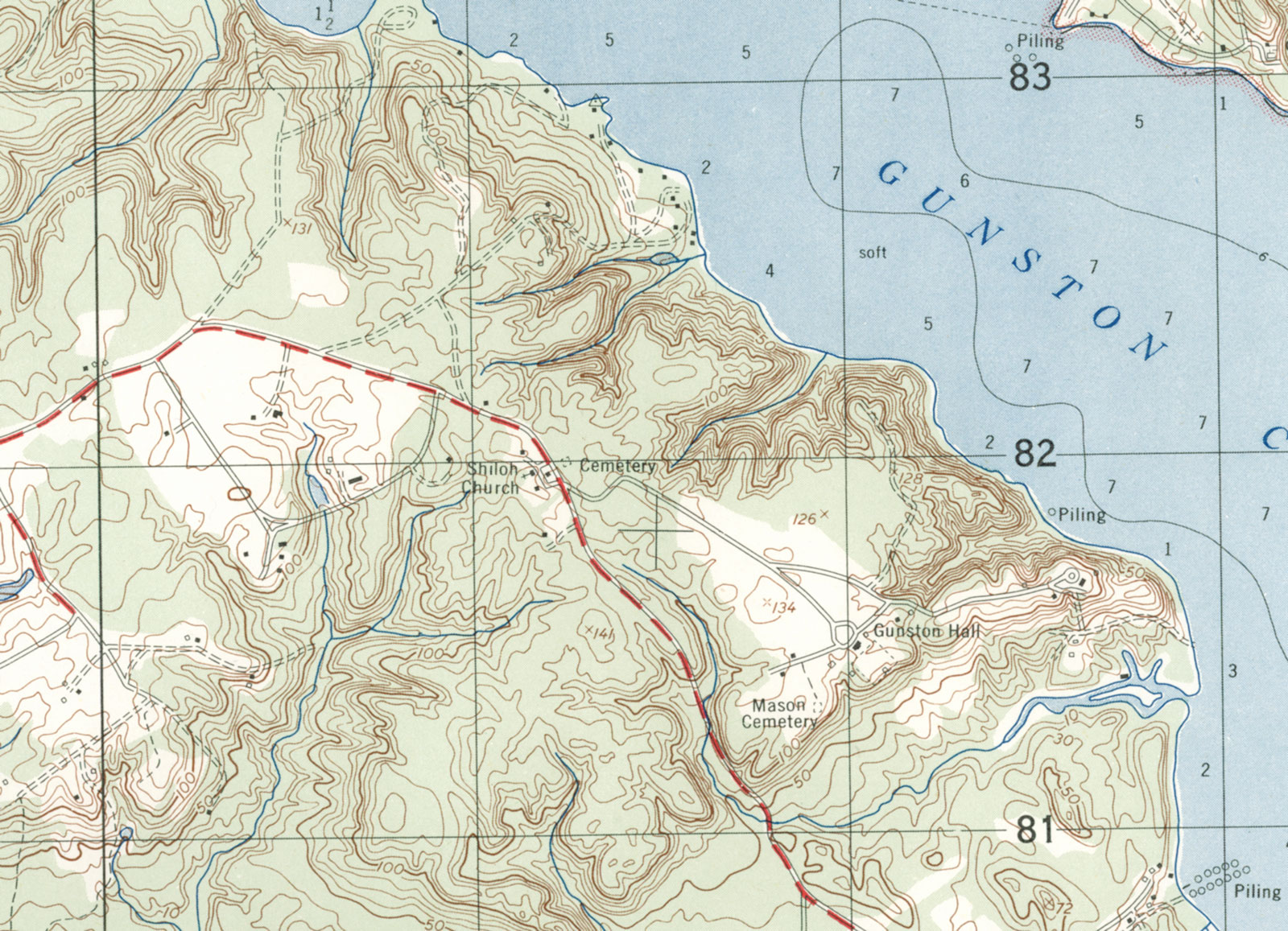
Color scan of the source contour map
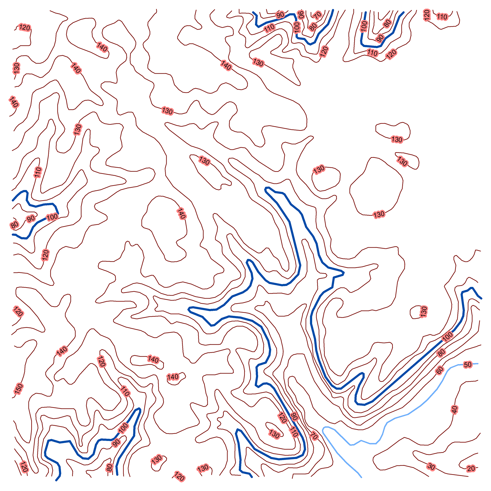
Vectorized contours
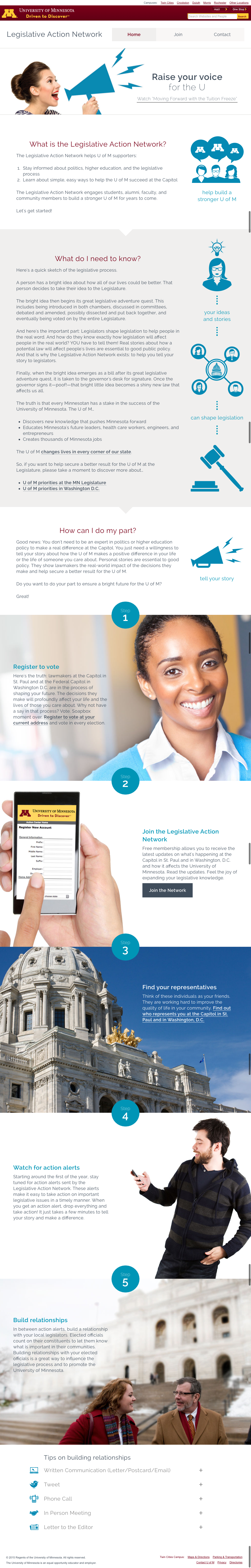
Legislative Action Network Website
The University of Minnesota’s grassroots coordinator (the "Legislative Action Network") laid out his vision for a vastly simplified LAN website in winter 2014–2015. An editor, a designer, and I were assigned to the project. After the editor revised the proposed site content to the grassroots coordinators' satisfaction, the designer and I set to work. She quickly had a vision which we rapidly prototyped and iteratively tweaked, with the occasional check-in and validation get-together with the coordinator. As a result, in several days we reduced a large, difficult to navigate, mobile-unfriendly site to a responsive, three-page website with a modern and vastly different appearance. After design and development work, the content and design were moved into a Drupal website.
Web address: legislative-action.umn.edu

The University’s Footprint
In 2011, I was asked to provide a way for audiences to explore the impact of the University of Minnesota on their county and legislative districts. Using Aristotle DMDS data to match ZIP codes to counties and legislative districts, I took hundreds of thousands of rows of alumni, student, and faculty/staff data from various sources to provide aggregate data at county and legislative-district levels, with a map-based front end to view the county-level data.
In order to generate a clickable web map of the counties of Minnesota, I used the HTML Image Map Plugin for QGIS. Unfamiliar with QGIS and spatial data formats at the time, I quickly learned what was needed to load the county polygons and export clickable image maps for the web, one version with counties labeled, one without.
You'll have to pardon the use of Web Mercator and non-cartographic county boundaries on this one. It was, after all, my first-ever web map and use of a GIS.
Web address: govrelations.umn.edu/footprint
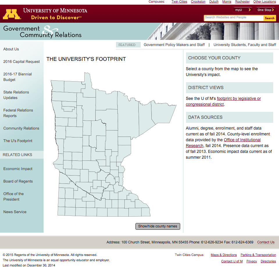
Unlabeled county map of Minnesota
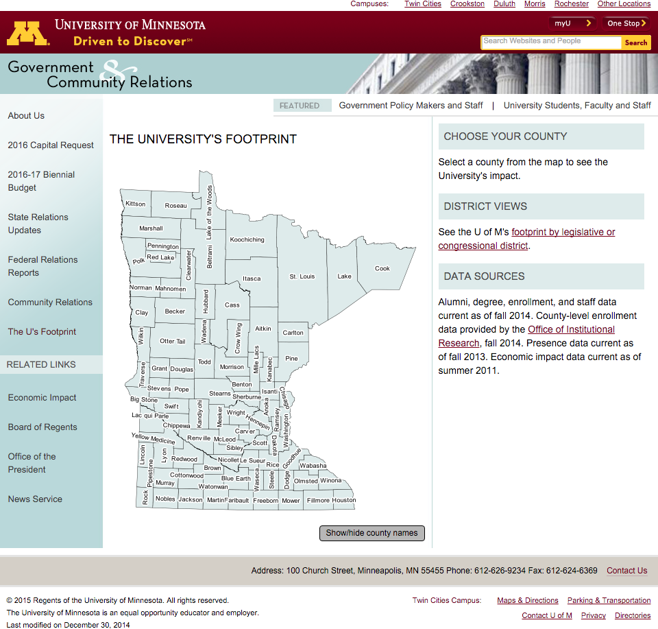
Map of Minnesota counties with labels
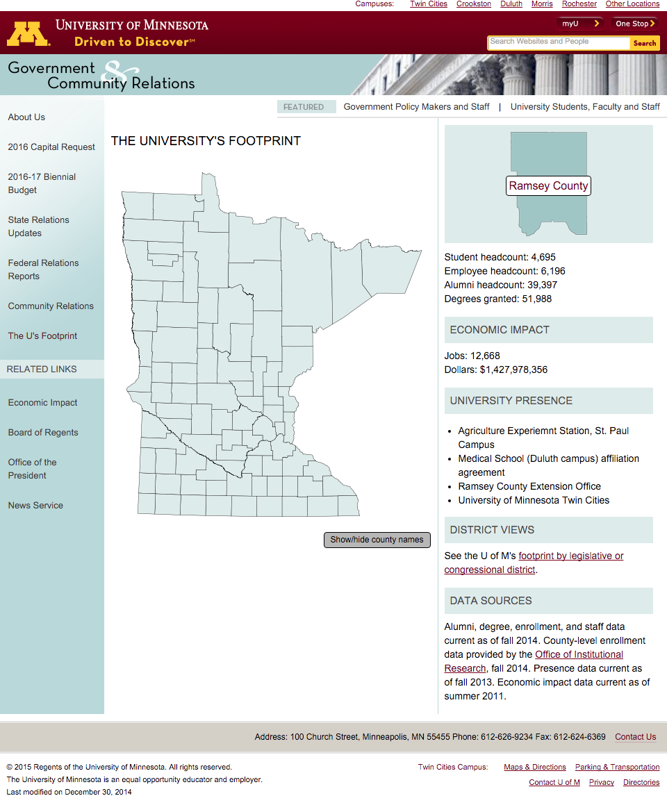
Information about Ramsey county displayed
Most content © Peter Wiringa. All rights reserved. Work samples © their owners. Grown from Twitter Bootstrap. Social media icons from Social Buttons for Bootstrap.